November 2024
Elin
Project Overview
The visual identity for Elin, a premium cosmetics brand.
Deliverables
Brand Identity
Logo Design
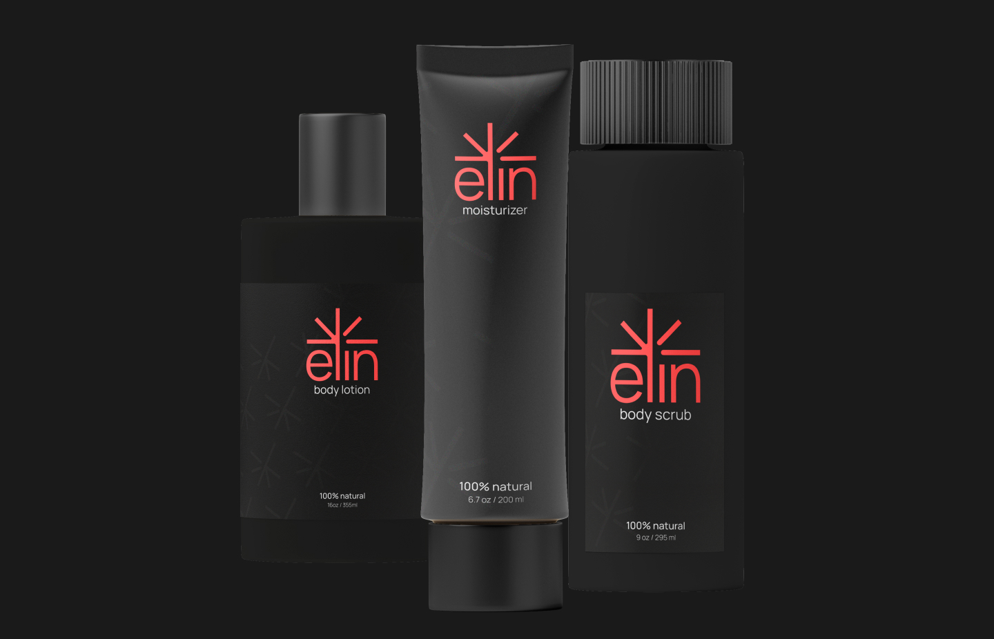
Packaging Design
Posters
Industry
Beauty
Date posted
November 2024
Project overview
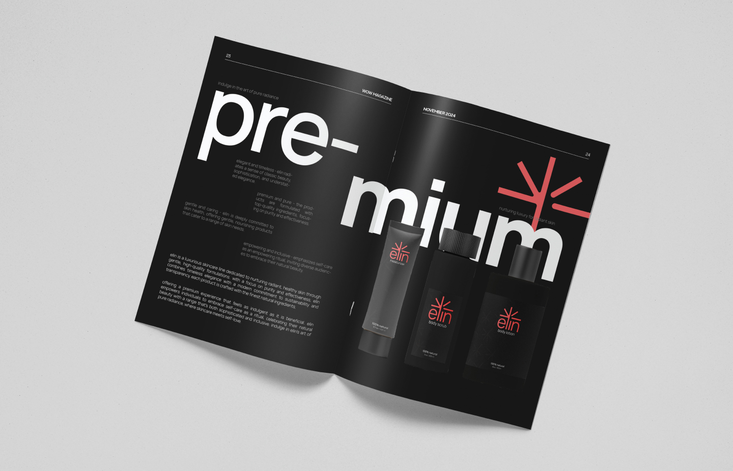
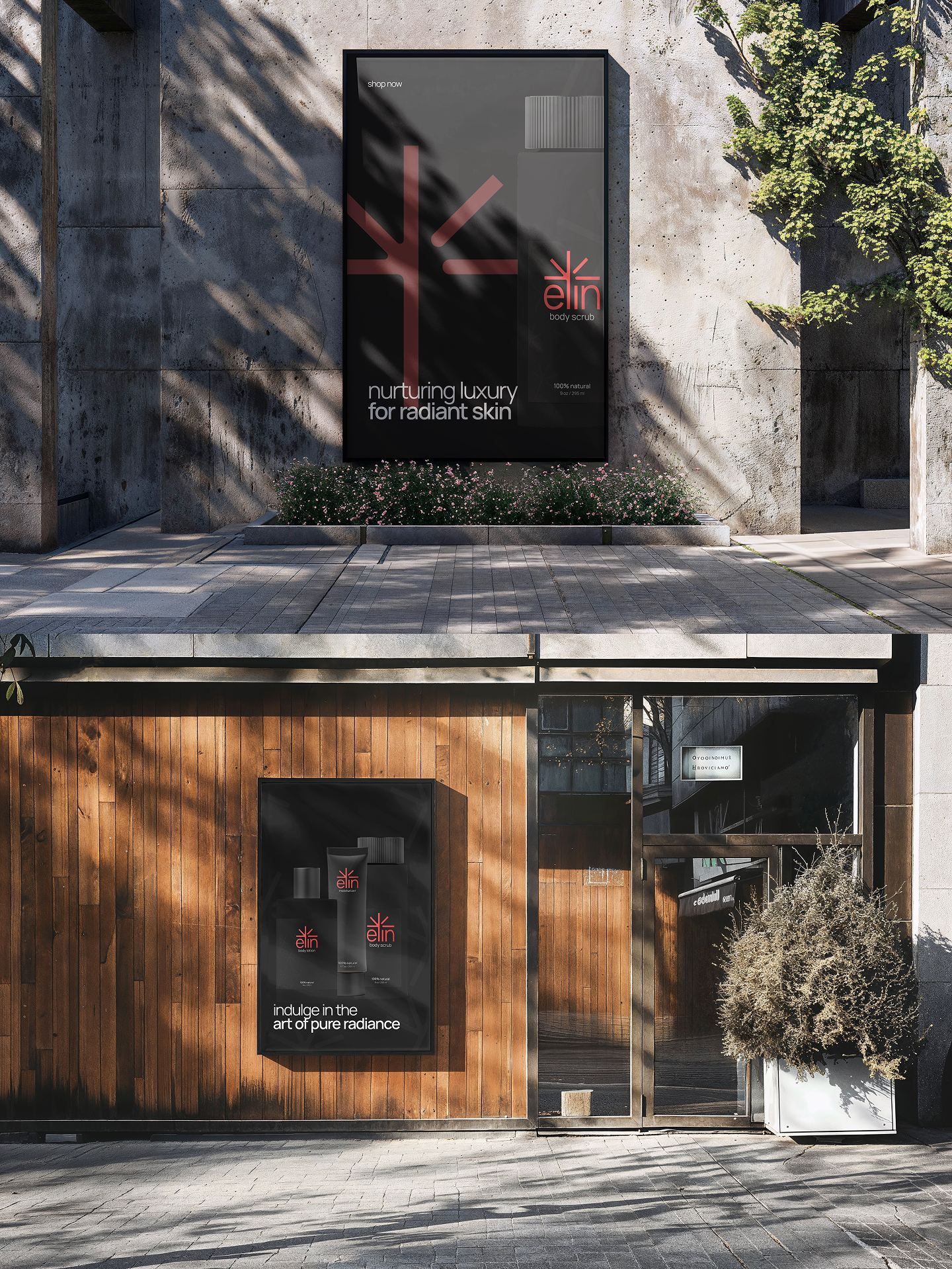
The Elin brand identity was developed for a premium cosmetics company aiming to blend modern elegance with a bold, confident presence. The goal was to create a visual language that feels luxurious yet approachable, appealing to a contemporary audience that values quality and style. This identity system combines a vibrant, standout accent color with clean, minimalist typography and refined neutrals to communicate trust, sophistication, and beauty.
Logo design
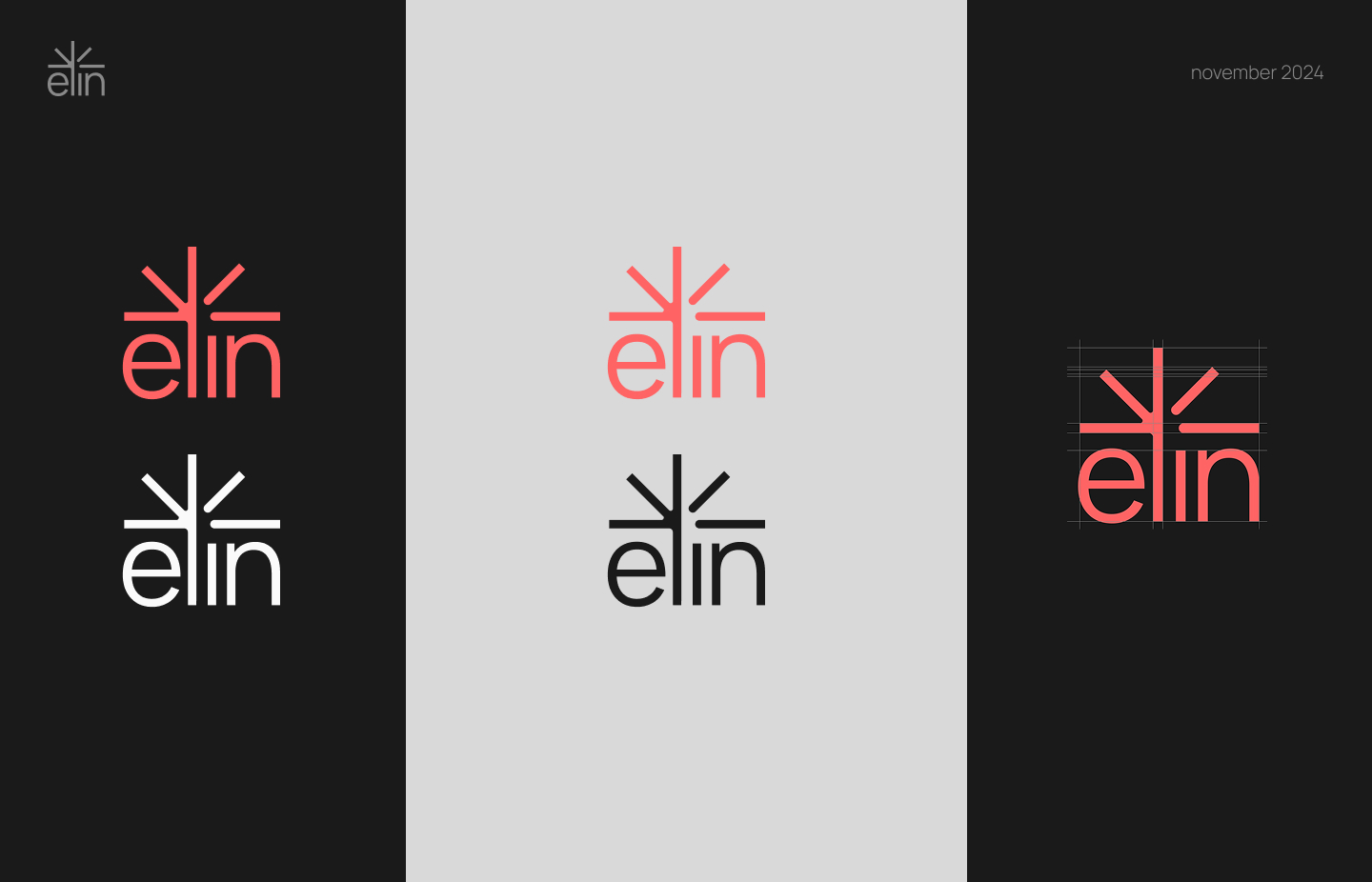
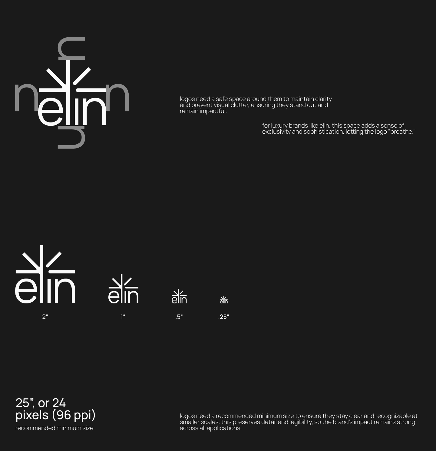
The elin logo exudes modern elegance with a minimalist, lowercase typeface in a warm coral-pink hue against a rich, dark background. a refined, branching icon above the text evokes natural beauty and growth, symbolizing purity and renewal. simple yet sophisticated, the design captures elin’s essence: luxurious, gentle, and timeless.
Colours & typography
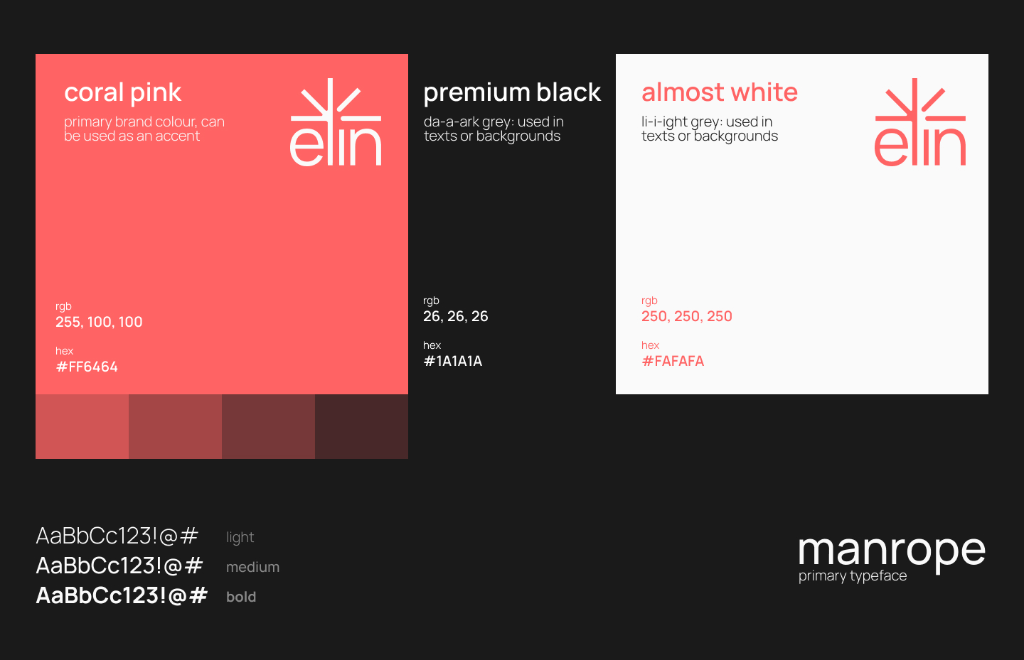
The main color, Coral Pink (#FF6464), is vibrant and warm—used as a signature accent to convey energy, confidence, and modern femininity. It's paired with Premium Black (#1A1A1A) for a sleek, elegant feel and Almost White (#FAFAFA) to maintain a clean, minimal look, reinforcing the luxury aesthetic. The chosen typeface, Manrope, is modern and geometric, offering readability and sophistication with its light, medium, and bold styles—perfect for a brand that values both clarity and class.
Keep exploring!
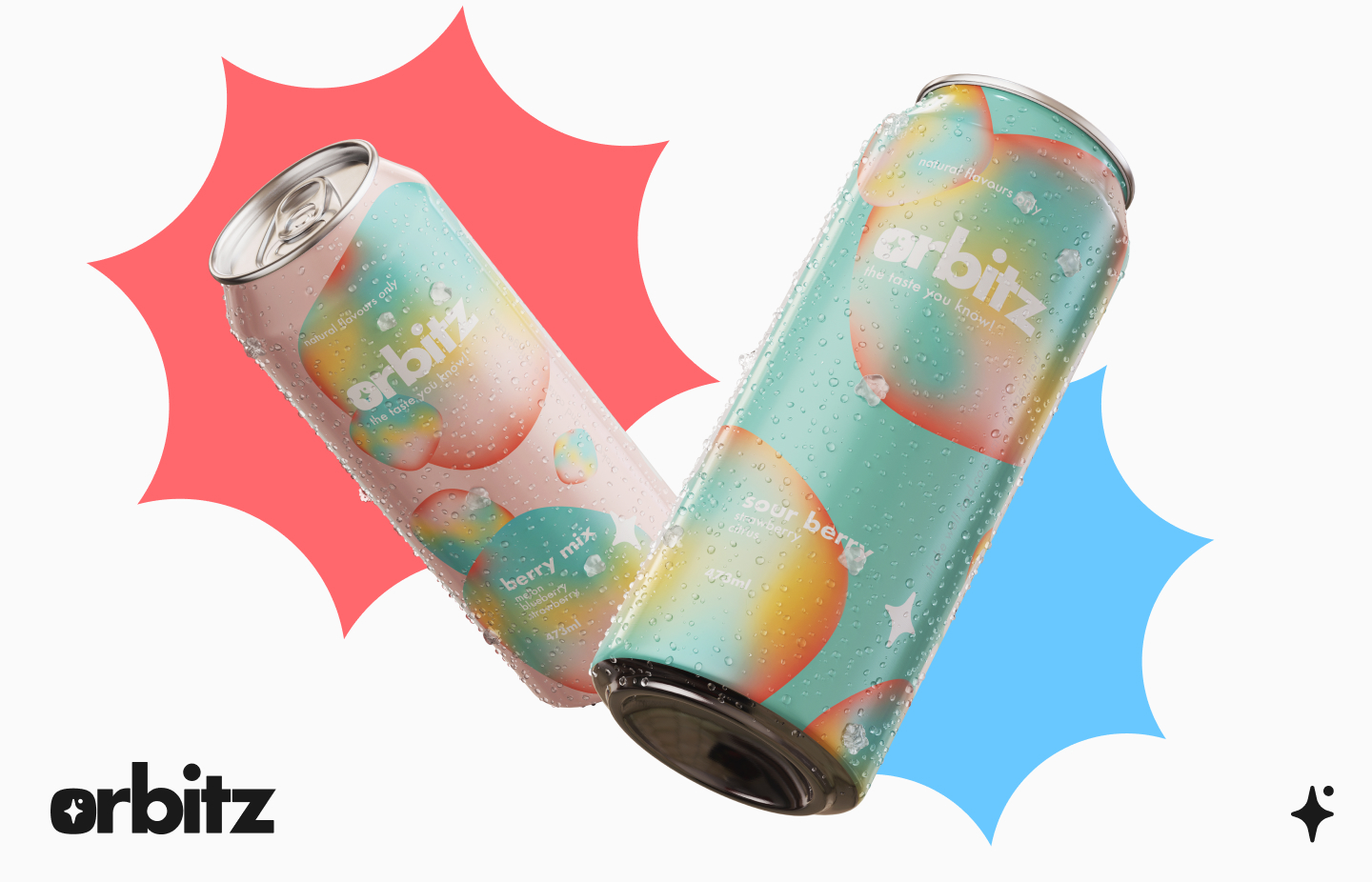
Reincarnation of a soft drink brand identity and a website.
Let me show you my vision
Click!